

Explorer 130# Silk Cover
Black Ink Flood
Soft Touch Lamination
Red Foil Red Foil
White Ink White Ink

Feather

Explorer 130# Silk Cover

Red Foil + White Ink

Feather Sample 4

The most complex feather sample combines red metallic foil with white ink on a black ink flood base. Soft touch lamination adds a premium tactile feel between the layers.

Credit: Black Birch Design Studio

About Red Foil + White Ink

This sample showcases the most complex layer combination in the Feather series, demonstrating how multiple specialty printing techniques can work together. The black ink flood creates a rich, deep background that makes the metallic red foil truly pop with dramatic contrast.

Soft touch lamination applied between the base layers and the specialty inks provides a premium tactile experience while protecting the print. The white ink enables crisp, opaque text and details that would otherwise be invisible on the dark background.

Why Laminate?

You might wonder why a soft touch laminate sits in the middle of this stack rather than on top. The answer is the black flood underneath: we can't lay digital foil directly over full-color print.

The printable soft touch laminate does three jobs. First, it's the surface the foil needs. It's engineered to work with our sleeking foil and acts as a barrier between the foil and the print, so the red can go anywhere on the sheet, whatever is printed below. Second, it steadies the sheet. Laminate holds back the shrinkage paper goes through each time it's heated, which helps the white ink printed afterward line up. Third, it gives the piece its rose-petal soft touch finish and protects the print.

There are trade-offs. Lamination can shift color, and we can only foil one side of a double-sided laminated piece. For layered foil and ink work like this, though, printable laminate is what we recommend. It's the foundation of our substrate pyramid for a reason.

Best Practices

File Setup

Adobe Illustrator

Dual Spot Color Setup

Setting up HP Foil and HP White 1 in Adobe Illustrator

Step 1 of 12
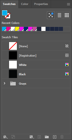
Illustrator Swatches Panel

Open the Swatches Panel

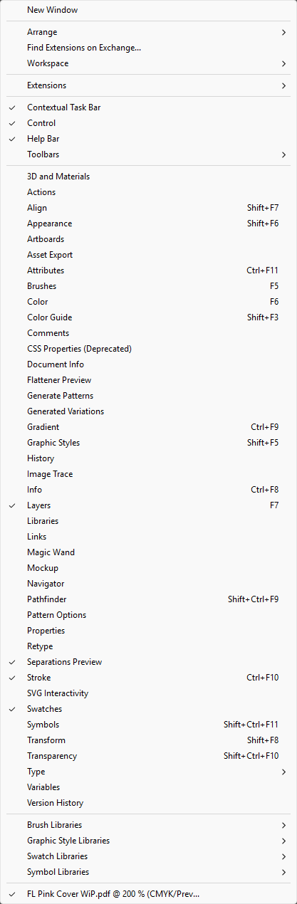
In Adobe Illustrator, go to Window > Swatches to open the Swatches panel. You'll create two spot colors here: HP Foil and HP White 1.

💡

You can also use the keyboard shortcut F5 to toggle the Swatches panel.

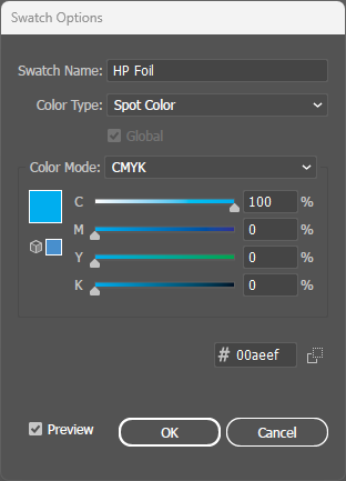
HP Foil Swatch Dialog

Create HP Foil Spot Color

Click the Swatches panel menu and select New Swatch. In the dialog:

  • Swatch Name: HP Foil
  • Color Type: Spot Color
  • Color Mode: CMYK
  • Set Cyan to 100% (for visibility)
⚠️

Critical: The name must be exactly HP Foil with correct capitalization.

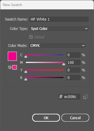
HP White 1 Swatch Dialog

Create HP White 1 Spot Color

Create another new swatch for white ink:

  • Swatch Name: HP White 1
  • Color Type: Spot Color
  • Color Mode: CMYK
  • Set Magenta to 100% (for visibility)
⚠️

Critical: The name must be exactly HP White 1 with correct capitalization and spacing.

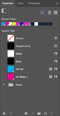
Both Swatches in Panel

Verify Both Swatches

Your Swatches panel should now show both spot colors:

  • HP Foil - Cyan preview (will print as metallic red foil)
  • HP White 1 - Magenta preview (will print as opaque white)
💡

The preview colors are just for visibility - actual output uses the specialty inks.

Select Foil Artwork

Select Foil Artwork

Select all artwork elements that should print with red metallic foil. These are typically decorative accents and metallic highlights.

💡

Use Select > Same > Fill Color to quickly select all elements with the same fill.

Apply HP Foil

Apply HP Foil to Selection

With your foil artwork selected, click the HP Foil swatch to apply it as the fill color. The artwork will appear cyan but will print as metallic red foil.

Select White Ink Artwork

Select White Ink Artwork

Now select all artwork elements that should print with white ink. These are typically text and details that need to be visible on the dark background.

Apply HP White 1

Apply HP White 1 to Selection

With your white ink artwork selected, click the HP White 1 swatch to apply it. The artwork will appear magenta but will print as opaque white ink.

Open Attributes Panel

Open the Attributes Panel

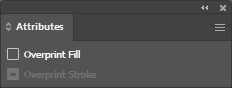
Go to Window > Attributes to open the Attributes panel. This panel controls overprint settings which are critical for both spot colors.

⚠️

Important: The next step is critical for BOTH spot colors!

Enable Overprint Fill

Enable Overprint Fill for Both

Select ALL artwork using HP Foil or HP White 1 spot colors. In the Attributes panel, check the Overprint Fill checkbox.

⚠️

Critical: BOTH HP Foil AND HP White 1 must have Overprint Fill enabled. Without this, spot color areas will knock out underlying artwork, causing gaps.

Illustrator Layers Panel

Verify Layer Order

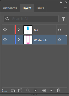
Before exporting, verify your layer order in the Layers panel. The stacking order should match the print order:

  • Top: White Ink elements (prints last, on top)
  • Middle: Red Foil elements
  • Bottom: Base artwork and backgrounds
💡

Layer order in Illustrator determines which elements print on top of others.

PDF Output Preview

Verify in PDF Output Preview

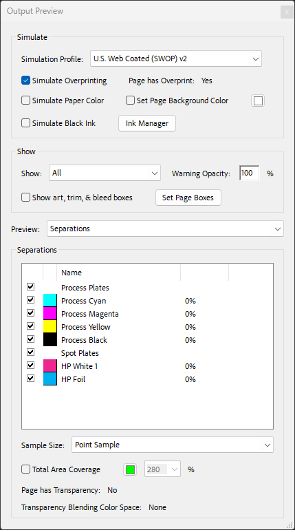
Export your file as PDF and open in Adobe Acrobat. Go to Print Production > Output Preview. In the Separations list, verify you see:

  • Process Plates: Cyan, Magenta, Yellow, Black
  • Spot Plates: HP White 1, HP Foil
💡

If either spot color is missing from the list, go back and verify the swatch was created correctly with exact naming.