

About Gold Foil + Black Ink
Combining metallic gold foil with rich black ink creates a classic, elegant aesthetic that has been prized in luxury printing for centuries. HP Indigo's digital foil process brings this timeless combination into the digital age, enabling short runs and variable data with no setup costs.
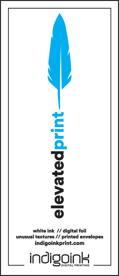
This sample showcases gold foil providing the luxurious metallic sheen while process black ink adds definition, contrast, and fine detail to the design. The interplay between the warm gold tones and deep black creates visual depth and sophistication.
Adding a printed layer turns the foil into an accent, and the order of operations follows from how sleeking foil works. Foil sticks to ink, so it can't be added after the fact: the gold is printed and foiled first, and the sheet then goes back through the press for the black.
Why Keep Foil and Ink Apart?
Gold and black look like they belong together, so it's tempting to butt them right up against each other. Here's why we don't: they print in separate passes, and the paper moves in between.
Paper is essentially a sponge. As heat drives the water out during foiling, the sheet shrinks, so the black lands on a slightly smaller sheet than the one it was designed for. Even on a well-maintained press, expect up to a millimeter of shift in any direction. That's why we ask for at least 0.25" between foil and printed elements. The margin buys you freedom, too: when nothing overlaps the foil, any foil color can pair with any ink.
If your design needs the ink to wrap tightly around the foil, there are other routes. A knockout is possible for larger foil shapes if the foil edges are expanded by 0.125", but only with our printable gold and silver foils. Printable laminate steadies the sheet and handles fine detail better, and for truly tight registration we'll often move the job to our hot stamper. Tell us what you're after and we'll help you choose.
Best Practices
- Design for contrast: Plan your design so gold foil and black ink complement each other. Use foil for highlights and accents, black for detail work and text.
- Layer order matters: Gold foil prints first, then black ink prints on top. Design with this stacking order in mind.
- Safe margins: Keep at least 0.25" between foil and black ink elements. They print in separate passes, and up to a millimeter of shift is normal.
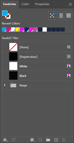
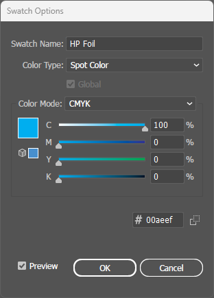
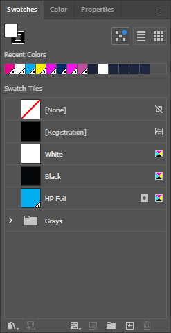
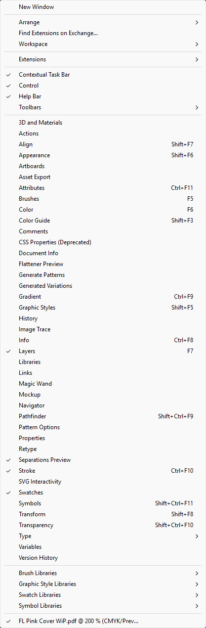
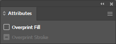
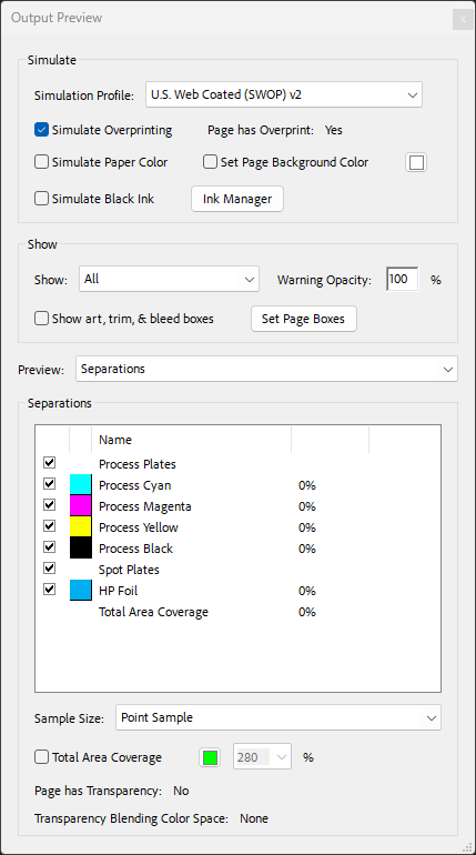
- File setup: Create foil areas as a spot color named exactly "HP Foil" - the black ink uses standard process black (K).
File Setup
Digital Sleeking Foil Colors
Click any swatch to see a detailed sample. Our digital sleeking foil adheres to HP Indigo toner, enabling custom foil designs without costly engraved plates.