About CMYK Over Foil
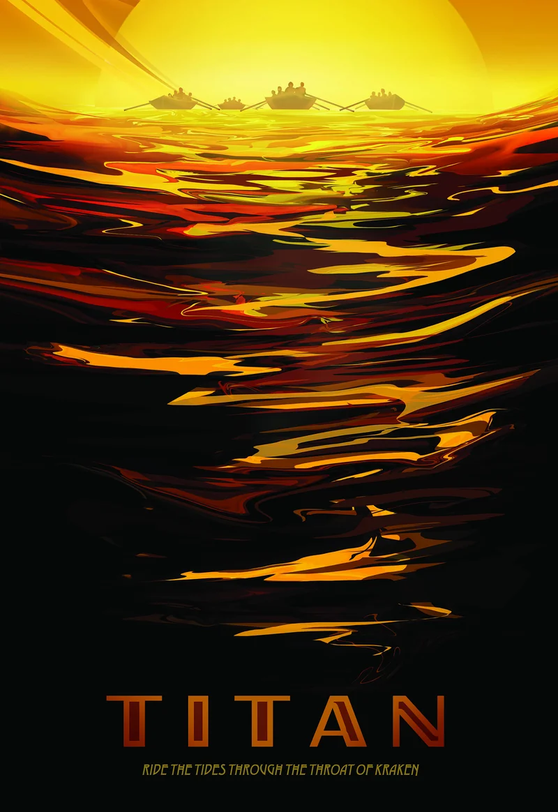
Printable foil opens up possibilities that traditional foil stamping can't match. Because gold and silver foils are directly printable, we can lay down a metallic foundation and then print full-color CMYK artwork on top of it. The result is something you can't achieve any other way: colors that shimmer with an underlying metallic warmth, shifting subtly as the light catches the surface.
The layer stack works like this: we start with a smooth coated substrate (Explorer 130# Silk Cover), print the gold foil layer first, then run the sheet back through the press to apply the CMYK artwork directly on top. Finally, we add a protective UV gloss coating to seal everything in. The foil-first, ink-second order is counterintuitive if you're used to traditional foil stamping, but it's what makes the metallic color interaction possible.
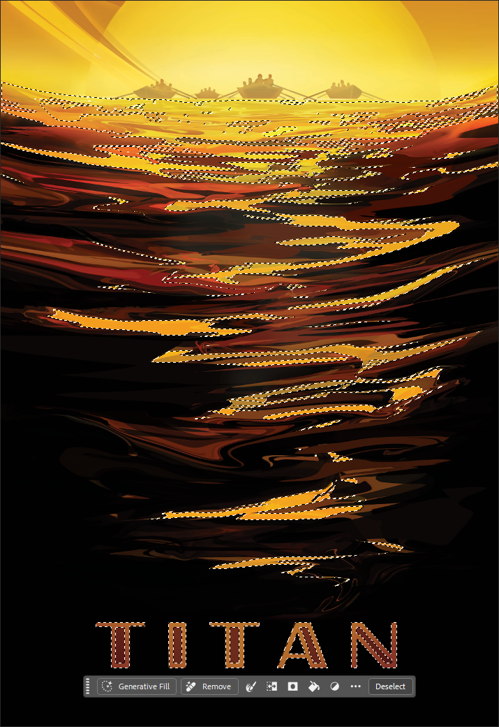
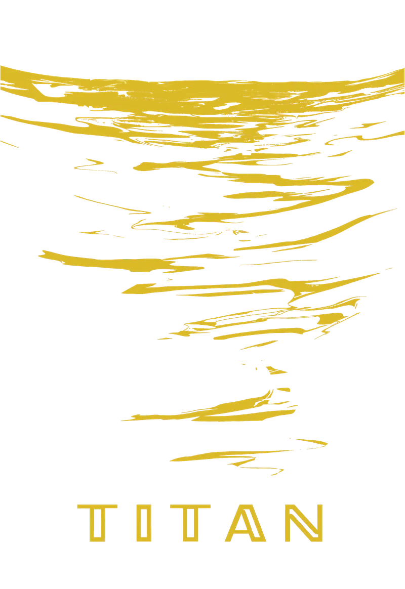
Smooth coated stocks like this silk cover sit at Tier 2 of our substrate compatibility pyramid. They're reliable performers for foil work, though not quite as forgiving as printable laminate. Registration tolerance runs about ±1mm in any direction, which is tight by industry standards but still requires thoughtful design. Close inspection of the "Titan" lettering on this sample may reveal minor registration variation from sheet to sheet.
Hold this piece and tilt it under a light source. The UV coating gives your fingertips a smooth, glossy glide across the surface, while the colors seem to glow from within. That's the metallic substrate doing its work: even where the CMYK coverage is heavy, a hint of warmth comes through. The effect is most pronounced in the lighter tonal areas, where the gold has room to breathe.
Why UV Coating?
You might wonder why we add a UV coating when the foil could stay exposed and shiny. Here's the practical answer: ink printed on foil is more vulnerable than ink printed on paper. Without a protective layer, the CMYK artwork can scratch, scuff, or flake off with handling.
The UV gloss coating serves two purposes. First, it seals the print, protecting the ink layer from physical damage during handling, mailing, or display. Second, the gloss finish enhances the underlying colors and amplifies the metallic shimmer. It's protection that also makes the piece look better.
Is it always required? Not necessarily. For pieces that will be framed behind glass or handled minimally, you might skip it. But for anything expected to be passed around, tucked into a pocket, or shipped through the mail, UV coating is our recommendation. Think of it as insurance that pays for itself in durability.
Best Practices
Design Considerations
-
Design for color shift: Colors printed over foil will appear darker and warmer than the same colors on paper. The metallic substrate isn't white, so expect hues to shift. Test swatches or request proofs if color accuracy is critical.
-
Keep saturation under 200%: The more ink you layer over foil, the less metallic shimmer shows through. We recommend keeping total ink coverage below 200% for designs where the metallic effect matters. Higher coverage works, but you'll lose that luminous quality.
- Bold over subtle: Large shapes and solid color blocks show the metallic interaction better than fine gradients. The foil effect gets lost in busy details, so give it room to breathe in your composition.
-
Plan for registration tolerance: Foil and CMYK layers can shift up to 1mm in any direction. Avoid designs where precise alignment between foil edges and printed elements is essential. Build in visual margins or use overprint strategies that hide minor drift.
File Setup Essentials
-
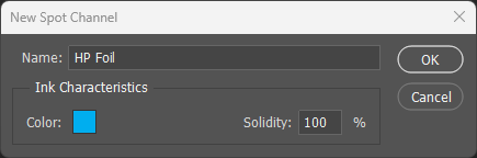
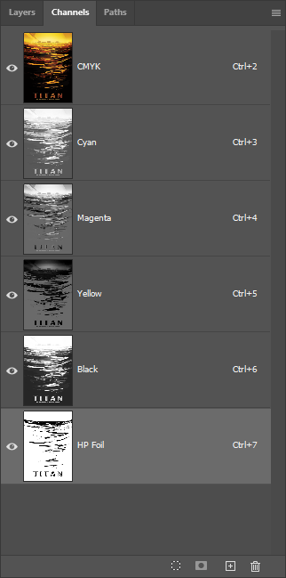
Name the spot channel exactly: The spot color channel must be named
HP Foil(case-sensitive) for the press to recognize it. An incorrectly named channel will be flattened into CMYK and won't print as foil. - Enable Overprint: In Illustrator and InDesign, foil elements must have Overprint Fill and Overprint Stroke enabled. This ensures the foil layer remains separate from the CMYK artwork during output.
- Print order is automatic: The press prints foil first, then CMYK on top. You don't need to manage layer order in your file for production purposes, but organizing layers logically helps during design and troubleshooting.
Substrate & Finish
- Smooth coated stocks work best: Gloss and silk finishes provide reliable foil adhesion and minimize background noise. Avoid textured or uncoated papers, which can produce patchy coverage.
- Choose heavier weights: Cover stocks (100# and up) remain more stable during multi-pass processing. Heavier sheets reduce registration drift and sheet-handling problems.
- UV coating recommended: A gloss or satin UV overcoat protects the ink, enhances color vibrancy, and extends the life of the piece. Strongly recommended for pieces that will be handled.
Common Pitfalls
- Over-saturated colors: Heavy ink coverage (300%+ total) obscures the metallic foundation entirely. You'll get rich color, but lose the shimmer that makes this technique distinctive.
- Thin lines at foil edges: Fine details where CMYK meets foil edges are the most unforgiving for registration. Consider thickening strokes or adding a buffer zone of solid color.
- Expecting exact color matches: The same CMYK build will look different on foil than on paper. Plan for this in your design rather than trying to fight it.