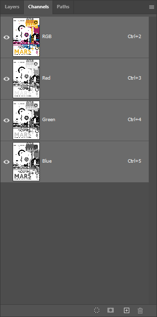
About White Ink on Colored Substrate
Colored paper is one of the simplest ways to add dimension to a printed piece without specialty finishing equipment. Instead of starting with white stock and printing your way to color, you begin with a substrate that's already part of your palette. White ink makes this approach viable for full-color work by providing an opaque base wherever you need accurate CMYK reproduction.
The layer stack is straightforward: we start with Neenah Classic Crest Red Pepper 100# Cover, an uncoated stock with a deeply saturated red tone. We print HP White 1 under all CMYK artwork to ensure accurate color reproduction, use pure white ink for white elements, and leave the remaining areas unprinted so the red paper serves as the background. The paper color becomes a design element in its own right, framing the artwork without requiring any ink at all.
We regularly stock six colored papers in the Neenah Classic Crest line: Epic Black, Patriot Blue, Desert Storm, Red Pepper, Antique Grey, and Cobalt Blue. All are available in 100# cover weight, which handles multi-pass printing reliably. Other colors and brands can be sourced on request, though lead times vary. Colored stock achieves a depth, consistency, and variety of background color that ink alone cannot match—the paper is dyed throughout, not just surface-coated.
Pick up this Red Planet piece and the first thing you notice is the texture. Classic Crest has a subtle tooth that's distinctly different from the glossy smoothness of coated papers. The red paper shows through in the shadowed areas of the Mars landscape and in portions of the background where we deliberately omitted white ink, reinforcing the Martian theme. It's a collaboration between design and material that you can feel as well as see.
Why Colored Stock?
You might wonder why we'd start with colored paper when we could print any background color on white stock. It's a fair question, and the answer involves both practical and aesthetic considerations.
Three factors make colored stock worth considering. First, depth and richness. Colored papers achieve a saturation and uniformity that printed ink backgrounds cannot match—the color is dyed through the paper fibers, not just sitting on the surface. Second, uncoated texture. Colored papers like Classic Crest have a tactile quality that glossy coated stocks lack. Third, creative integration. When the substrate becomes part of the design, you're working with the material rather than just on it. Areas where paper shows through feel intentional rather than like mistakes.
CMYK inks are transparent, so printing directly on colored paper without white ink causes colors to shift—blues on red become purple-ish, yellows become orange. This Red Planet sample avoids that effect by printing white under all CMYK areas, preserving accurate color reproduction. But that color-shift characteristic can be a powerful design tool when used intentionally.
Best Practices
Design Considerations
- Let the paper work for you: Colored stock excels as a background element. Design your composition so the paper color frames or complements your artwork rather than competing with it.
- White under all CMYK: For accurate color reproduction, place white ink beneath all CMYK artwork. Use pure white ink for white elements. Leave areas unprinted where you want the paper color to show.
- Embrace the substrate: The most effective designs treat the paper color as an integral element rather than a limitation to work around. The depth and richness of colored paper can't be replicated with ink.
File Setup Essentials
-
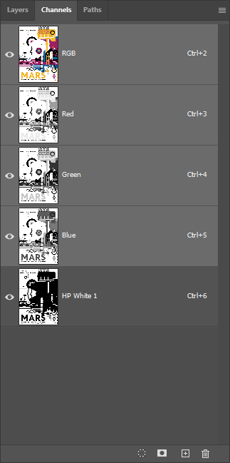
Name the channel exactly: The spot color channel must be named
HP White 1(case-sensitive). The press won't recognize variations like "White" or "HP white 1". - White goes under CMYK: Print order is substrate → HP White 1 → CMYK. The white provides the opacity base; CMYK prints on top.
- Use cyan for preview: Set your HP White 1 spot channel to 100% cyan for visibility during design. The preview color doesn't affect printing; it's purely for file organization.
Substrate & Finish
- Uncoated stocks behave differently: Expect slight ink absorption and a softer appearance compared to coated papers. This is part of the character, not a defect.
- 100# cover weight recommended: Heavier stocks handle multi-pass printing better and provide a more premium feel. Text weights are possible but less forgiving.
- No UV coating on uncoated: UV coating requires a gloss-coated surface. Uncoated colored stocks cannot be UV coated. If protection is essential, consider lamination alternatives or aqueous coating.
Common Pitfalls
- White ink peeking out: White ink is thick and tends to expand slightly as it fuses to the paper. To prevent white from showing at the edges of CMYK elements, contract the white layer by about 2 pixels in Photoshop or 0.2pt in Illustrator. We're happy to check your file or run a proof to catch issues before full production.
- Over-covering the stock: If 90%+ of your design is white-backed, consider whether white stock might be simpler and more cost-effective. Colored paper shines when the color is visible.


