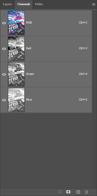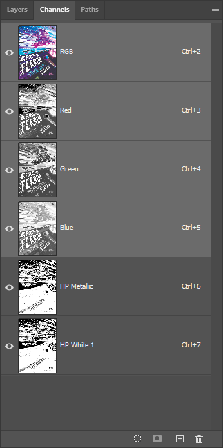
About HP Indigo Metallic Ink
Sometimes you want a touch of shimmer without the full commitment of foil. HP Indigo Metallic Ink occupies that middle ground: suspended metallic particles that catch light and shift as you move the piece, but with an ambient glow rather than a chrome-mirror finish. We reach for it when a design needs that extra something across large areas where foil would be overkill or impractical.
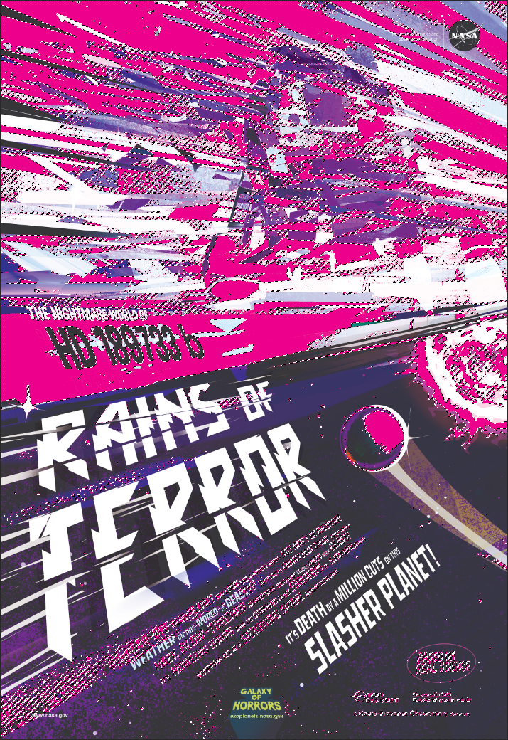
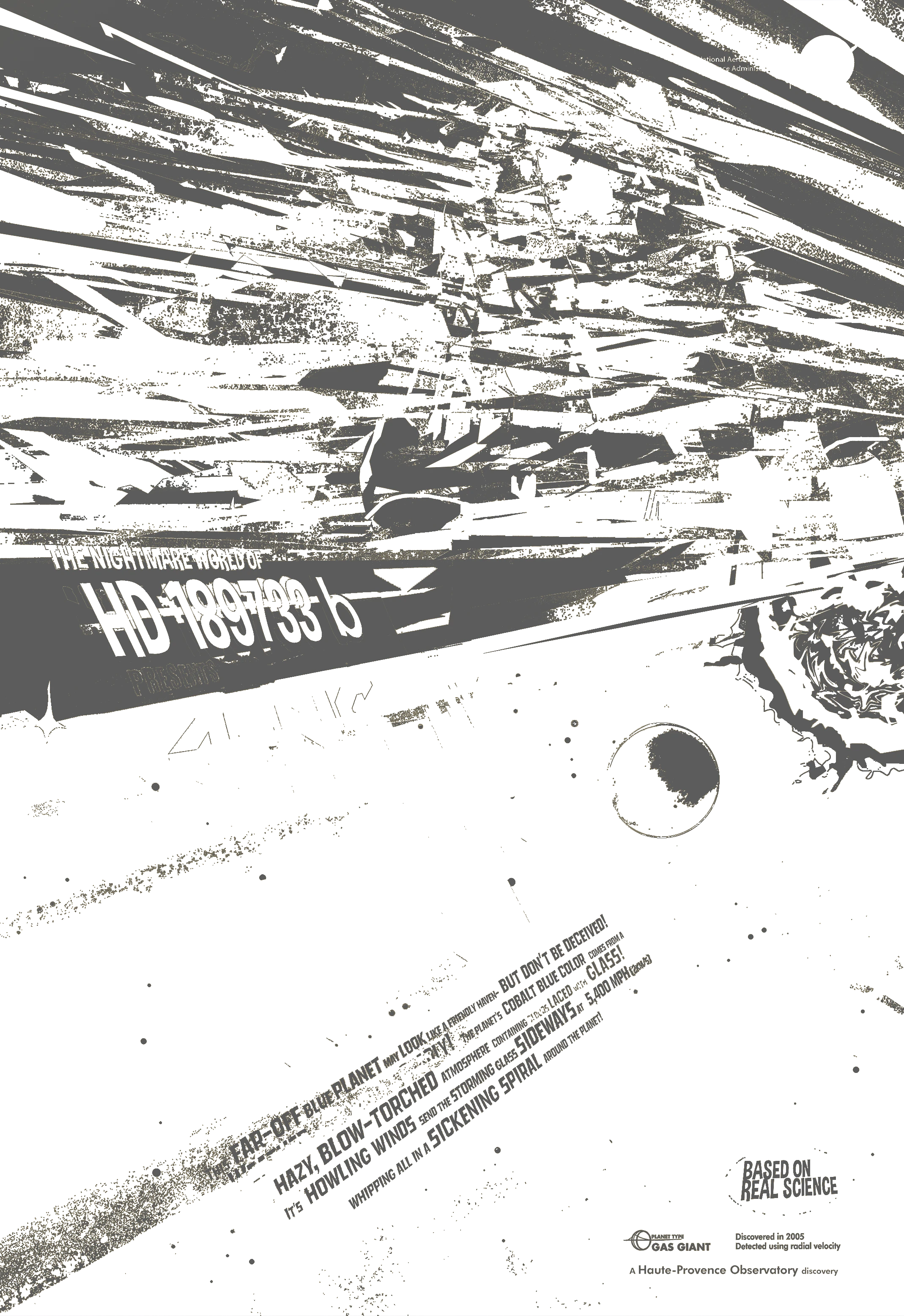
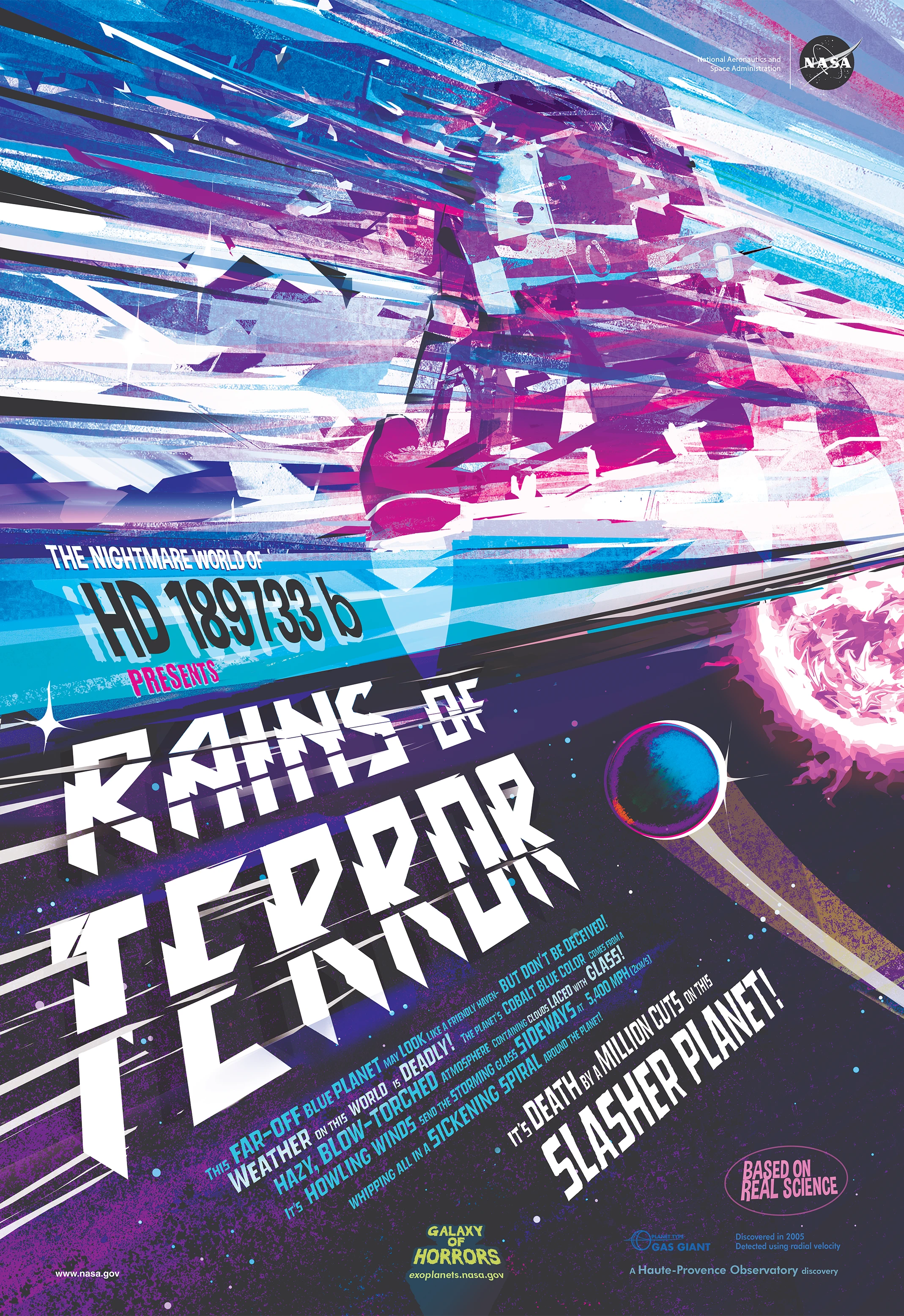
The layer stack is straightforward. On coated papers like Explorer 130# Gloss Cover, we print metallic ink first, then apply CMYK artwork directly on top. Three layers total: substrate, metallic, CMYK. On uncoated papers, we add a white ink primer before the metallic layer to prevent absorption into the porous surface. Four layers: substrate, HP White 1, metallic, CMYK. The Rains of Terror poster showcases both approaches, which is why we offer coated and uncoated versions.
From a production standpoint, metallic ink prints in a single pass through the press. There's no foil application step, no separate registration to worry about between metallic and color layers. Everything runs together, which makes metallic ink more predictable than foil for pieces where the metallic effect spans large areas. We've printed entire backgrounds in metallic with consistent results.
Hold the finished piece and tilt it under a light source. The sky area shimmers with an ethereal quality, shifting from a cool silvery tone to something warmer as the angle changes. Run your fingertips across the surface and you'll feel the smooth finish of the coated stock. The metallic effect lives beneath the CMYK layer, giving colors a subtle luminosity that you won't find on plain paper. It's atmospheric rather than attention-grabbing, and that's exactly the point.
Why Metallic Ink?
Metallic ink shines in situations where you want metallic enhancement across larger areas of your design. Foil excels at precise accents, text outlines, and small graphic elements where chrome-like reflectivity makes an impact. But when your design calls for an entire sky that shimmers, or a background with subtle metallic warmth, foil becomes impractical. That's where metallic ink takes over.
The practical advantages are worth considering. Metallic ink runs in a single press pass alongside your CMYK colors. There's no separate foil application step, no added turnaround time, and no registration tolerances to manage between the metallic and color layers. For designs with metallic coverage over large areas, this translates to more consistent results and lower production costs compared to foil.
We should be honest about what metallic ink can't do. It won't match the mirror-like reflectivity of gold or silver foil. If you're after that chrome finish for logos or type treatments, foil remains the better choice. Think of metallic ink as ambient shimmer versus foil's spotlight reflection. Both have their place; the key is matching the technique to the design intent.
Best Practices
Design Considerations
- Use metallic for atmosphere, not accents: Large tonal areas like skies, gradients, and backgrounds show the shimmer effect to its best advantage. Small details and fine text won't benefit from the metallic treatment.
- Expect color shifts: CMYK printed over metallic will appear warmer and slightly darker than the same build on white paper. The metallic substrate isn't neutral, so plan for this shift in your design.
-
Keep total ink coverage under 200%: The more ink you layer over metallic, the less shimmer shows through. We recommend staying below 200% total coverage for areas where the metallic effect matters. Higher coverage works, but you'll lose that luminous quality.
- Leverage viewing angles: The shimmer is most noticeable when tilting the piece. Design with this in mind, placing metallic areas where readers naturally angle the page.
File Setup Essentials
-
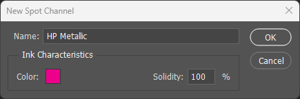
Name the spot channel exactly: The channel must be named
HP Metallic(case-sensitive) for the press to recognize it. An incorrectly named channel will flatten into CMYK and won't print as metallic. - Set Solidity to 100%: This ensures accurate visual preview in Photoshop. Lower solidity values will make the channel appear more transparent on screen.
- Enable Overprint: In Illustrator and InDesign, metallic elements must have Overprint Fill and Overprint Stroke enabled. This keeps the metallic layer separate from CMYK during output.
- Print order is automatic: The press prints metallic first, then CMYK on top. You don't need to manage layer order for production, but organizing layers logically helps during design.
Substrate & Finish
- Coated papers are ideal: Smooth coated surfaces (silk, gloss, matte coated) produce the cleanest metallic effect with maximum shimmer visibility.
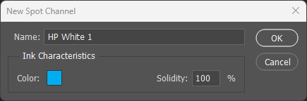
- Uncoated requires white underlayer: Always add an HP White 1 layer beneath the metallic on uncoated or textured papers. Without it, metallic particles absorb into the porous surface and appear dull.
- Consider heavier weights: Cover stocks (100# and up) handle multi-layer printing more reliably. Heavier sheets stay more stable during processing.
- UV coating protects the finish: A gloss or satin UV overcoat protects the metallic layer from scratching. Recommended for pieces that will be handled frequently.
Common Pitfalls
- Expecting foil-level reflectivity: Metallic ink creates ambient shimmer, not mirror reflection. If you need chrome-finish accents, foil is the better choice.
- Fine metallic details: Small text and thin lines in metallic ink may appear muddy or inconsistent. Save the metallic treatment for larger shapes.
- Forgetting white ink on uncoated: This is the most common mistake. Skipping the HP White 1 layer on uncoated paper results in a dull, absorbed-looking finish with minimal shimmer.
- Over-saturated coverage: Ink coverage above 300% obscures the metallic foundation entirely. You'll get rich color, but lose the effect that makes this technique distinctive.