



























About INDIGLOW
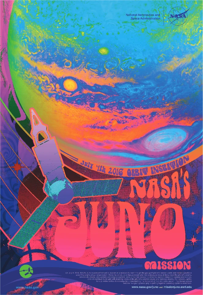
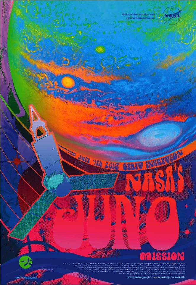
Fluorescent pink breaks the rules of color printing. Where traditional inks can only reflect the light that hits them, fluorescent pigments reach into the invisible ultraviolet spectrum and generate visible light from it. The result is colors that appear to glow from within, saturations your monitor can't display, and pinks, oranges, and purples that have been impossible to reproduce on press until now.
IndiGlow is our custom color profile that automatically incorporates fluorescent pink into any file you send us. Submit your artwork in RGB or Lab color mode, and the press analyzes every pixel to determine where fluorescent enhancement will improve color accuracy. Standard IndiGlow adds two passes of fluorescent pink to CMYK, producing six separations. IndiGlowUp goes further, adding extra cyan and yellow passes for eight total separations and an even wider gamut.
The effect is strongest in saturated pinks, electric blues, oranges, and deep purples. Bright greens are more challenging since pink sits across the color wheel, so extended greens come out as richer forest shades rather than neon. For the best results, choose the brightest white paper you can find. Papers with high optical brightening agents (OBAs) amplify the fluorescent effect. Gloss substrates reach full intensity; matte papers produce softer, still-beautiful results.
Hold an IndiGlow print next to its CMYK equivalent and the difference is immediate. Colors that looked acceptable before suddenly seem dull by comparison. Take both outside into direct sunlight and the gap widens further, since UV-rich daylight feeds the fluorescent pigments exactly what they need. The more light you give this ink, the more color it gives you back.
Why INDIGLOW?
You might wonder why we built IndiGlow when fluorescent pink spot colors already exist. The answer is workflow: IndiGlow requires zero changes to your files.
Send us any RGB or CMYK file from Photoshop, Illustrator, Canva, or a decade-old PDF. No spot colors to set up, no layer planning, no expertise in fluorescent behavior required. The press translates your file into a six-color (or eight-color) language automatically. If you need precise control over where fluorescent pink appears, we have other techniques for that. But for the vast majority of projects where you want colors to look as good as possible with minimum effort, IndiGlow handles everything.
Best Practices
Design Considerations
- Design for contrast: Dark backgrounds amplify fluorescent effects exponentially. Subtle, muted backgrounds make fluorescent elements pop harder. White backgrounds make them sing. The worst thing you can do is surround important saturated areas with competing bright colors.
- Know the color wheel: IndiGlow excels at reproducing saturated pinks, purples, oranges, and electric blues. Bright greens are more challenging—pink is across the color wheel from green, so extending greens requires a two-step process that results in deeper forest and Kelly shades rather than neon.
- Think beyond daylight: Under blacklight, fluorescent pink glows a beautiful deep red. If your project will be displayed in UV-lit environments (events, retail, nightclubs), IndiGlow creates hidden effects that only reveal themselves under the right lighting.
File Setup
- Submit in RGB or Lab: IndiGlow works best when it has access to your full intended color range. RGB and Lab color modes preserve colors that CMYK would clip.
- Embed your color profile: sRGB, Adobe RGB, or Display P3 all work well. The profile tells us what your colors are supposed to look like.
- Avoid pre-converting to CMYK: Converting to CMYK before submission limits your color range before the extended gamut processing can take effect. Let the press handle the separation.
Substrate Selection
- Choose bright whites: For the best outcome, pick the brightest white paper you can find. Specifically, look for materials with high volumes of Optical Brightening Agents (OBAs)—those are the compounds that make paper glow blue under blacklight. Brighter whites don't just look better; they amplify the fluorescent effect.
- Gloss amplifies, matte softens: Fluorescent pink reaches its full optical density on glossy substrates. Matte papers absorb more light and produce slightly softer results—still beautiful, but less intense.
- Consider UV coating: Adding UV coating over IndiGlow prints pushes the limits of good taste in the best possible way. The coating amplifies both the sheen and the fluorescent intensity.
Common Pitfalls
- Proofing is a trap: Your monitor cannot show you what fluorescent pink actually looks like. Neither can photo proofs or digital samples. If your project depends on seeing the exact color—and it should—invest in a hard copy proof. The money you spend will save you far more in disappointment.
- Colored stock requires testing: Fluorescent pink on dark paper needs a white ink foundation, just like any other bright color. But white ink affects how the fluorescent properties behave. Always test when working on anything darker than cream—fluorescent ink on white paper is much more striking than fluorescent ink on white ink.
Videos
An excellent breakdown of why screens struggle to represent certain colors—including the fluorescent inks we use in IndiGlow. Required viewing for understanding the physics of color reproduction.