About UV Reactive Ink
Hidden messages. Covert authentication. That moment of discovery under a blacklight when something invisible suddenly glows into view. HP Indigo Invisible Yellow occupies a category of its own in specialty printing: an ink that exists but doesn't exist, depending entirely on the light source. We reach for it when a project needs that element of surprise, a secret layer waiting to be revealed.
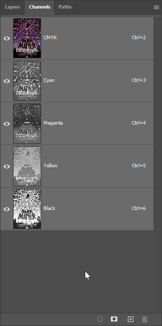
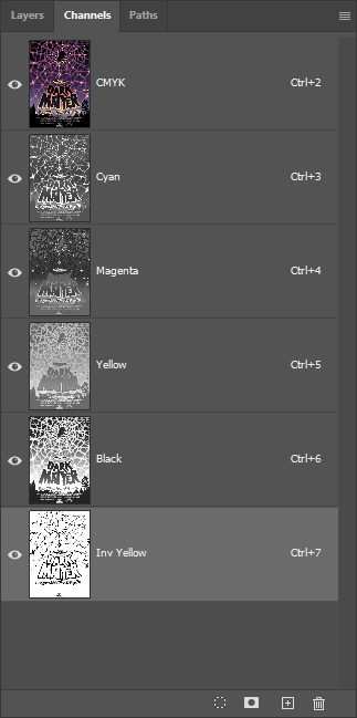
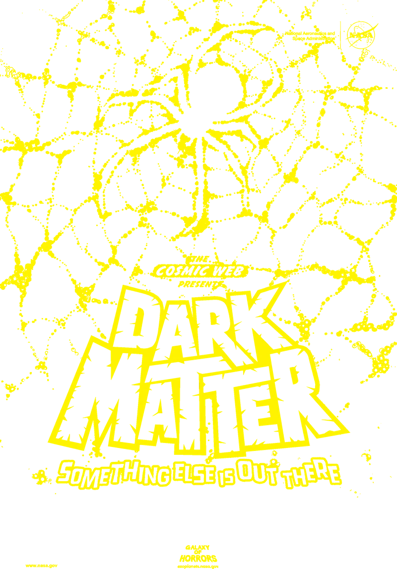
The layer stack is deceptively simple: we start with Explorer 130# Silk Cover, print the full-color CMYK artwork, and apply Invisible Yellow as the final separation. Then a scuffproof lamination protects everything. The UV reactive ink sits invisibly on top of the printed image, completely undetectable under normal lighting. Shine a blacklight at around 365nm wavelength, and the hidden design fluoresces with a bright yellow-green glow. Four layers total, but the magic happens in that nearly weightless final pass.
Here's what we've learned through testing: substrate selection matters more than you might expect. Many commercial papers contain optical brightening agents that fluoresce under UV light, and that background glow can overpower your hidden design. We recommend papers without optical brighteners for the strongest contrast. Smooth substrates may show a subtle gloss difference where the ink is applied, which lamination helps minimize. And because Invisible Yellow doesn't support halftone screening, we work with solid coverage only, adding multiple ink hits when a stronger fluorescent signal is needed.
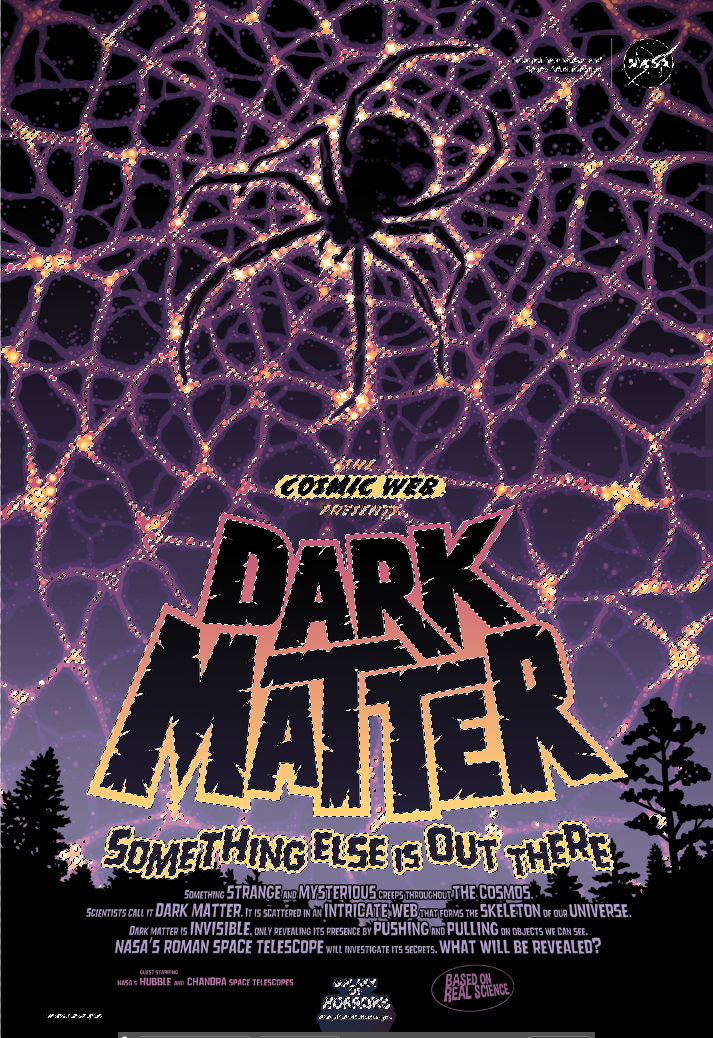
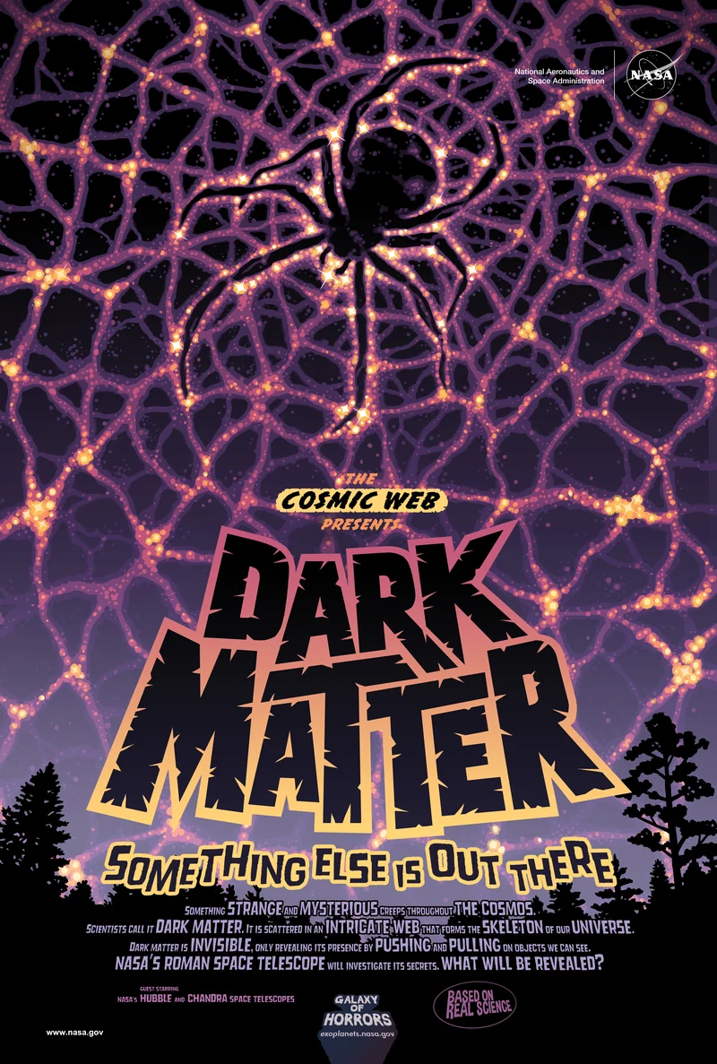
Hold this Dark Matter piece under normal room lighting and you see only the NASA poster artwork, creepy cosmic creatures lurking in deep blue shadows. Move it under a blacklight and the hidden dimension emerges: swirling tendrils of dark matter made visible, additional details that transform the composition. The lamination gives the surface a smooth, protected feel. It's one of those techniques where the reveal moment never gets old.
Why Test Before Production?
UV reactive ink behaves differently than most specialty techniques. With foil or metallic, you see results immediately after printing. With Invisible Yellow, the effect only reveals itself under specific lighting conditions, and several factors can interfere with the fluorescent signal in ways that aren't obvious until you check.
Three variables can silently undermine your results. First, optical brighteners in paper create competing fluorescence that washes out your design. Second, certain finishing coatings, particularly UV-blocking varnishes, can reduce or eliminate the fluorescent response entirely. Third, the underlying printed colors can affect signal strength, with some CMYK combinations performing better than others.
We always recommend testing the exact combination you plan to use: same substrate, same finishing, under the actual blacklight source your end users will have. A successful digital proof on one paper doesn't guarantee success on another. It takes a few minutes to verify and saves significant rework down the line.
Best Practices
Design Considerations
- Design for reveal impact: Consider what the hidden elements add to the viewer's experience. The best UV reactive designs create a meaningful transformation or reveal additional narrative when illuminated, not just random glowing areas.
- Use solid shapes only: HP Invisible Yellow doesn't support halftone screening. Design with solid coverage areas rather than gradients or screened tints. For stronger fluorescence, we can apply multiple ink hits.
- Plan for visible gloss differences: On smooth substrates, Invisible Yellow may create a subtle gloss change even under normal light. Apply UV ink over mid-tone areas (around 50% coverage) rather than solid whites or flat colors to minimize visibility. Lamination also helps mask this.
- Consider layering with other techniques: UV reactive ink pairs well with foil, metallic ink, or specialty substrates. Each layer adds dimension, and the UV reveal becomes an extra surprise within an already premium piece.
File Setup Essentials
-
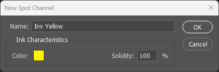
Name the spot channel exactly: The channel must be named
Inv Yellow(case-sensitive, with space) for the press to recognize it. Variations like "InvYellow" or "Invisible Yellow" will not work. - Set preview color to 100% Yellow: For visibility during design, set the spot channel color to 100% yellow. This helps you see placement clearly without affecting the actual invisible output.
- Invisible Yellow prints last: This is mandatory. Regardless of print mode, Inv Yellow must always be the final separation. The press handles this automatically when the channel is named correctly.
Substrate & Finish
- Avoid papers with optical brighteners: Many commercial papers contain optical brightening agents (OBAs) that fluoresce under UV light. This background glow competes with and can drown out the Invisible Yellow signal. Request non-brightened stocks for maximum contrast.
- Do not use clear substrates: Invisible Yellow creates a visible milky appearance on transparent materials. For clear substrates requiring UV effects, consider reverse printing with a white flood behind.
- Textured papers mask gloss differences: If visible gloss variation is a concern, matte or textured substrates naturally hide the ink application areas better than smooth coated stocks.
Common Pitfalls
- Test the complete solution before production: Some finishing coatings can interfere with UV fluorescence. Always test your specific combination of substrate, print, and finishing under blacklight before committing to a full run.
- Weak UV signal troubleshooting: If the fluorescent effect is underwhelming, check three things: verify your UV light source is approximately 365nm wavelength with adequate intensity, confirm the substrate has no optical brighteners, and consider adding additional ink hits for stronger coverage.
- Visible ink under normal light indicates a problem: Invisible Yellow should be completely invisible in standard lighting. If you see a tint, it suggests contamination during printing and should be flagged as a production issue.